- This is a book about the design of statistical graphics and, as such, it is concerned both with design and with statistics. But it is also about how to communicate information through the simultaneous presentation of words, numbers, and pictures. The design of statistical graphics is a universal matter - like mathematics - and is not tied to the unique features of a particular language.
- Graphical Excellence
- Excellence in statistical graphics consists of complex ideas communicated with clarity, precision, and efficiency. Graphical displays should:
- show the data
- induce the viewer to think about the substance rather than about methodology, graphic design, the technology of graphic production, or something else
- avoid distorting what the data have to say
- present many numbers in a small space
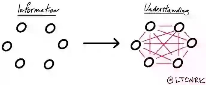
- make large data sets coherent
- encourage the eye to compare different pieces of data
- reveal the data at several levels of detail, from a broad overview to the fine structure
- serve a reasonably clear purpose: description, exploration, tabulation, or decoration
- be closely integrated with the statistical and verbal descriptions of a data set
- Excellence, nearly always of a multivariate sort, is illustrated here for fundamental graphic designs: data maps, time-series, space-time narrative purposes, providing a set of high-quality graphics that can be discussed in constructing a theory of data graphics
- Graphical excellence is the well-designed presentation of interesting data - a matter of substance, of statistics, of design
- Graphical excellence consists of complex ideas communicated with clarity, precision, and efficiency
- Graphical excellence is that which gives to the viewer the greatest number of ideas in the shortest time with the least ink in the smallest space
- Excellence in statistical graphics consists of complex ideas communicated with clarity, precision, and efficiency. Graphical displays should:
- Graphical Integrity
- Graphical integrity is more likely to result if these 6 principles are followed:
- the representation of numbers, as physically measured on the surface of the graphic itself, should be directly proportional to the numerical quantities represented
- clear, detailed, and thorough labeling should be used to defeat graphical distortion and ambiguity. Write out explanations of the data on the graphic itself. Label important events in the data.
- show data variation, not design variation
- in time-series displays of money, deflated and standardized units of monetary measurement are nearly always better than nominal units
- the number of information-carrying (variable) dimensions depicted should not exceed the number of dimensions in the data
- graphics must not quote data out of context
- Graphical integrity is more likely to result if these 6 principles are followed:
- Data-Ink and Graphical Redesign
- Five principles in the theory of data graphics produce substantial changes in graphical design. The principles apply to many graphics and yield a series of design options through cycles of graphical revision and editing
- Above all else, show the data
- Maximize the data-ink ratio
- Erase non-data-ink
- Erase redundant data-ink
- Revise and edit
- Five principles in the theory of data graphics produce substantial changes in graphical design. The principles apply to many graphics and yield a series of design options through cycles of graphical revision and editing
- Theory of Data Graphics
- Forgo chartjunk, including moire vibration, the grid (use gray grids), and the duck
- Well-designed small multiples are:
- inevitably comparative
- deftly multivariate
- shrunken, high-density graphics
- usually based on a large data matrix
- drawn almost entirely with data-ink
- efficient in interpretation
- often narrative in content, showing shifts in the relationship between variables as the index variable changes (thereby revealing the interaction of multiplicative effects)
- Small multiples reflect much of the theory of data graphics:
- for non-data-ink, less is more
- for data-ink, less is a bore
- Aesthetics and Technique in Data Graphics Design
- Graphical elegance is often found in the simplicity of design and complexity of data
- Attractive displays of statistical information:
- have a properly chosen format and design
- use words, numbers, and drawings together
- reflect a balance, a proportion, a sense of relevant scale
- display an accessible complexity of detail
- often have a narrative quality, a story to tell about the data
- are drawn in a professional manner, with the technical details of production done with care
- avoid content-free decoration, including chartjunk
- Epilogue
- Design is choice. The theory of the visual display of quantitative information consists of principles that generate design options and that guide choices among options. The principles should not be applied rigidly or in a peevish spirit; they are not logically or mathematically certain; and it is better to violate any principle than to place graceless or inelegant marks on paper. Most principles of design should be greeted with some skepticism, for word authority can dominate our vision, and we may come to see only through the lenses of word authority rather than with our own eyes. What is to be sought in designs for the display of information is the clear portrayal of complexity. Not the complication of the simple; rather the task of the designer is to give visual access to the subtle and the difficult - that is, the revelation of the complex.
What I got out of it
- Some of the deeper philosophy on what makes effective design and presentations