- The images and diagrams in this book reward careful study. Many are excellent treasures, complex and witty, intense with meaning.
- Note: This book is beautiful and worth getting just for the images and understanding what it takes to make a deeply meaningful image/diagram
- My books are self-exemplifying: the objects themselves embody the ideas written about. This has come about, in part, because my work is blessedly free of clients, patronage, or employers
- The principles of analytical thinking (and thus analytical design) are universal - like mathematics, the laws of Nature, the deep structure of language - and are not tied to any language, culture, style, century, gender, or technology of information display.
- Explanatory, journalistic, and scientific images should nearly always be mapped, contextualized, and placed on the universal grid. Mapped pictures combine representational images with scales, diagrams, overlays, numbers, words, images. Good mappings of realistic images have been produced throughout the long history of visual displays, but not often enough. An explanatory image is an explanatory image because it is a mapped image. Sensibly mapped pictures nearly always outperform purely pictorial representations for representing, explaining, and documenting evidence.
- Sparklines are datawords: data-intense, design-simple, word-sized graphics.
- Multiple sources and levels of data - use whatever evidence it takes to understand what is going on. Too often diagrams instead rely solely on one type of data or stay at one level of analysis
- Efficiency of design - the design should be straightforward with no unnecesary elements. Designs for analytical diagrams should be clear, efficient, undecorated, maplike. The metaphor is the map, not stupidity. Omitting boxes increases explanatory resolution
- The similar treatment of text, diagrams, and images suggests to readers that images are as relevant and credible as words and diagrams. A book design that treats all modes of information alike reinforces the point.
- All in one head - Megan Jaegerman did both the research and the design, breaking their common alienation. This design amplifies the content, because the designer created the content
- Charles Joseph Minard's data-map showing Napoleon's invasion and retreat of Russia may be one of the best designed diagrams of all-time
- Principle 1: Comparisons - show comparisons, contrasts, differences
- Principle 2: Causality, mechanisms, structure, explanation - show causality, mechanism, explanation, systemic structure
- Principle 3: Multivariate Analysis - show multivariate data; show more than 1 or 2 variables
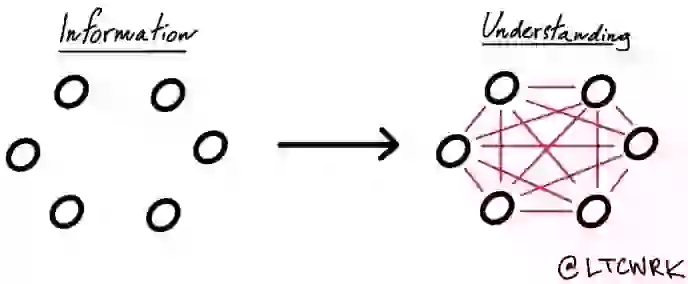
- Principle 4: Integration of Evidence - completely integrate words, numbers, diagrams
- Principle 5: Documentation - thoroughly describe the evidence. Provide a detailed title, indicate the authors and sponsors, document the data sources, show complete measurement scales, point out relevant issues.
- Principle 6: Content counts most of all - analytical representations ultimately stand or fall depending on the quality, relevance, and integrity of their content
- Making a presentation is a moral act as well as an intellectual activity
- A clear sign of cherry-picking is that a report appears too good to be true, provoking consumers of the report to mutter, "It's more complicated than that." Avoid overreaching, slippery language, stupendous conclusions
- Powerpoint is a competent slide manager but it should not impose its cognitive style on our presentations. Instead of showing a few informal talking points on a slide, why not print out an agenda for everyone?
- For serious presentations, replace PP with word-processing or page-layout software. Making the transition in large organizations requires a straightforward executive order: from now on your presentation software is Microsoft Word, not PP. Get used to it
- At a talk, paper handouts of technical reports effectively show text, data graphics, images. Printed materials bring information transfer rates in presentations up to that of everyday material in newspapers, reports, books, and internet news sites. An excellent paper size is 11x17 inches, folded in half to make 4 pages. That one piece of paper, can show the content-equivalent of 50 to 250 typical PP slides. Serious presentations might begin by handing out this paper and having the group read it. Following the reading period, the presenter might provide a guided analysis of the briefing paper and then encourage and perhaps lead a discussion of the material at hand.
What I got out of it
- A beautiful book that helped me better understand what an effective presentation and diagram looks like and some of the core mistakes to avoid. Incorporating and integrating words, images, graphs, and anything else which helps the reader more easily understand is the key.


